
When it comes to Power Apps, I’ve always been a fan of the Canvas Apps approach. It gives the space for creativity and the ability for a lot of customization. While Model-Driven Apps gives the developers and users a more streamlined user experience, I prefer the Canvas Apps route because of it’s expressive freedom, straight-forward and quick integration to data sources outside of Dataverse like Microsoft 365 Graph service and other external public API to get started. Now I’m not saying it’s not possible in Model-Driven Apps, but it’s a step shorter to my goals using the Canvas Apps.
My new favorite feature of Canvas Apps is it’s Express Design features and especially it’s feature to create Power Apps using the Figma UI Kit – Overview of creating app from Figma (preview) – Power Apps | Microsoft Learn. Which is what we’ll be diving into, in today’s blog.
In today’s article we’ll touch base on the following subjects:
- How I setup my Figma UI Kit for every project.
- How I use it as a Process Definition Documentation, Wireframing and Portfolio
- Which Figma plug-ins I’ve found useful to create a modern UI
- How I deal with Figma imported Power Apps with unrecognizable elements, objects and other quirky things.
Prerequisites:
- Power Apps features enabled for your Microsoft 365 Account
- Figma user account (Free).
Setting up Figma UI Kit
After registering and logging into your Figma account, navigate to Microsoft Power Apps – Create Apps from Figma UI Kit (Preview) – Figma and click on “Get a copy“.

Recommended Plug-ins
The following are the plug-ins that I am using in Figma for the moment, I am going to touch on a couple of them in this article, where you’ll have a look at how I use them.
Unsplash
The Unsplash Figma plug-in lets designers quickly search and insert high-quality, royalty-free images from Unsplash’s collection into their Figma designs. With just a few clicks, you can adjust the size, position, and opacity of images or add filters. The plug-in streamlines the design process, saving time and providing a seamless workflow within the Figma interface.
Blush
Blush is a Figma plug-in that provides customizable illustrations for designers to use in their projects. These illustrations are created by a community of artists using the Blush Brush tool and are easily accessible through the Blush Figma plug-in. With Blush, designers can customize the color, size, and orientation of the illustrations, and even mix and match different styles to create unique combinations. Blush also offers a “Sticker Sheets” feature for creating custom sticker sets, making it easy to add a personal touch to designs.
Wireframe
Wireframe is a Figma plug-in that simplifies the process of creating wireframes for websites, apps, and other digital projects. It provides pre-made components like buttons, forms, and navigation menus that designers can drag and drop into their wireframes, saving them time and effort. Additionally, Wireframe offers customization options to adjust colors, fonts, layout, spacing, and alignment of elements. Collaboration tools are also available for sharing wireframes and getting real-time feedback. With Wireframe, designers can create wireframes quickly and efficiently without the need for advanced design or wireframing software knowledge.
Avatars
Avatars is a Figma plug-in that allows designers to create and customize user avatars for their designs easily. The plug-in offers different styles, features, and accessories, including cartoonish, realistic, and minimalist avatars, allowing designers to create custom avatars for professional websites or fun mobile apps quickly. Avatars offers a range of preset avatars that can be customized to match the specific needs of a design. Its customization options allow designers to adjust the shape and size of different features, add accessories such as glasses and hats, and create avatars that match their design requirements. Overall, Avatars is a powerful Figma plug-in that makes it easy for designers to add human elements to their designs.
Low-Fidelity Prototyping
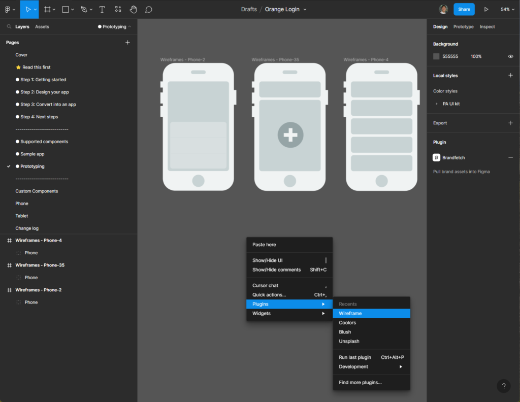
For low fidelity prototyping I am using a plug-in called “Wireframe“. With this tool you can easily make a mockup and create an overview of how the app will be looking like to stakeholders who doesn’t usually need the unnecessary screen details, but just an overview of the application’s business flow. I am also using this as a part of a portfolio and usually sets up a new Page category for both Prototyping and Portfolio.
Designing the Power App (Mobile)
Prepping the projects based on Figma UI Kit
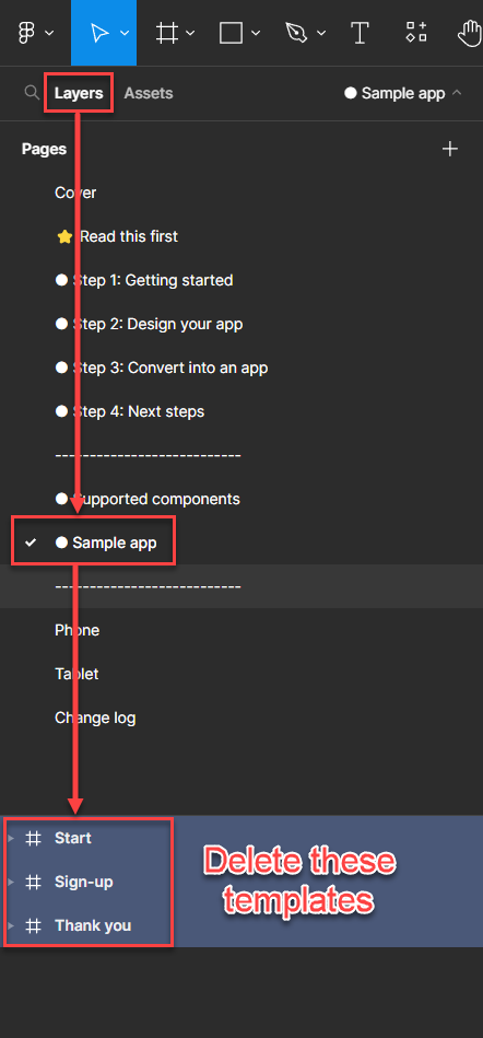
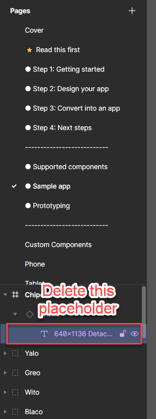
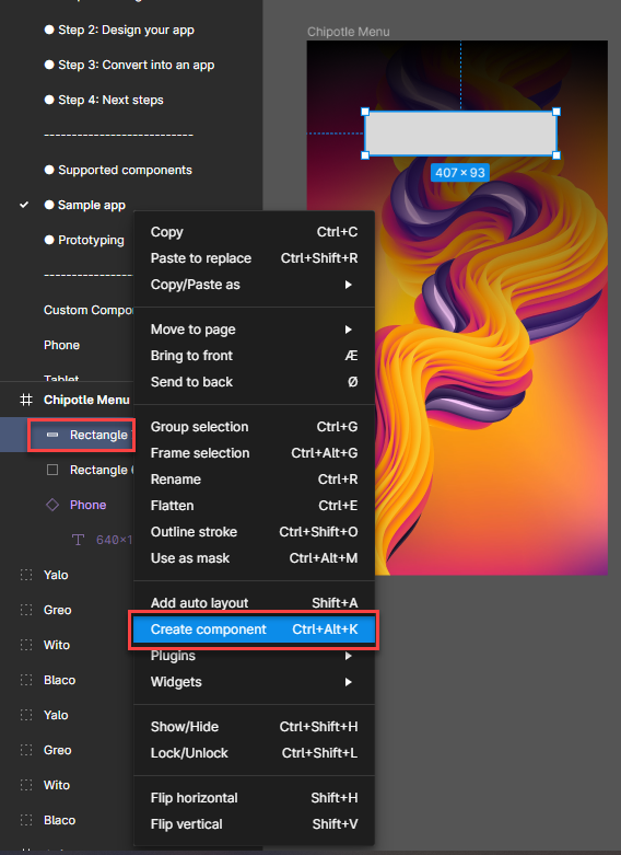
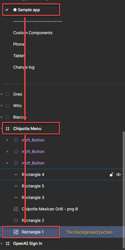
Navigate to “Layers” > “Sample app” > Delete the templates as highlighted above.
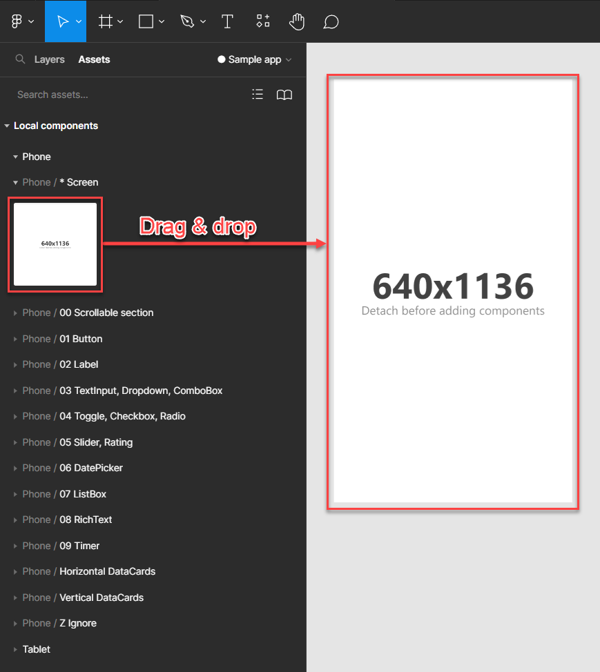
Drag and drop as many screens as you’d like for your app
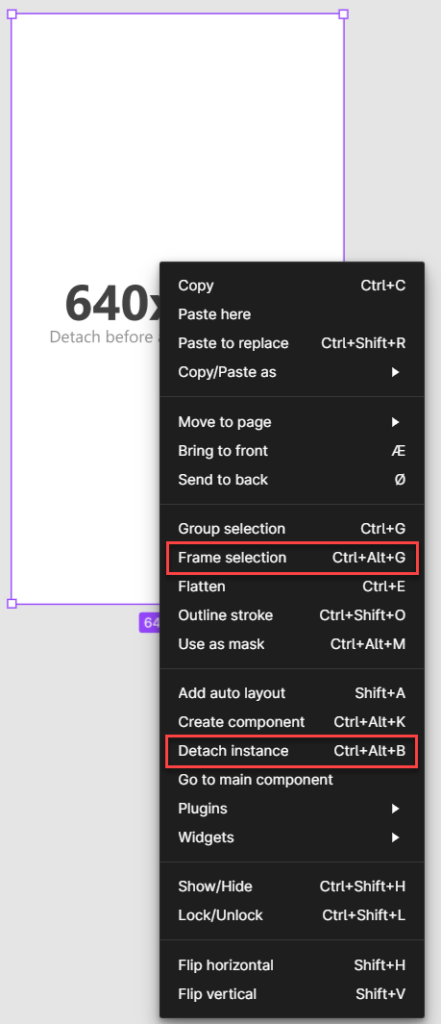
From the navigation menu on your left, you can now delete the placeholder text that indicates the frame width & height.
For each screen you’d have to “Detach instance” to start adding more components into the screen/frame. Also “Frame the selection“
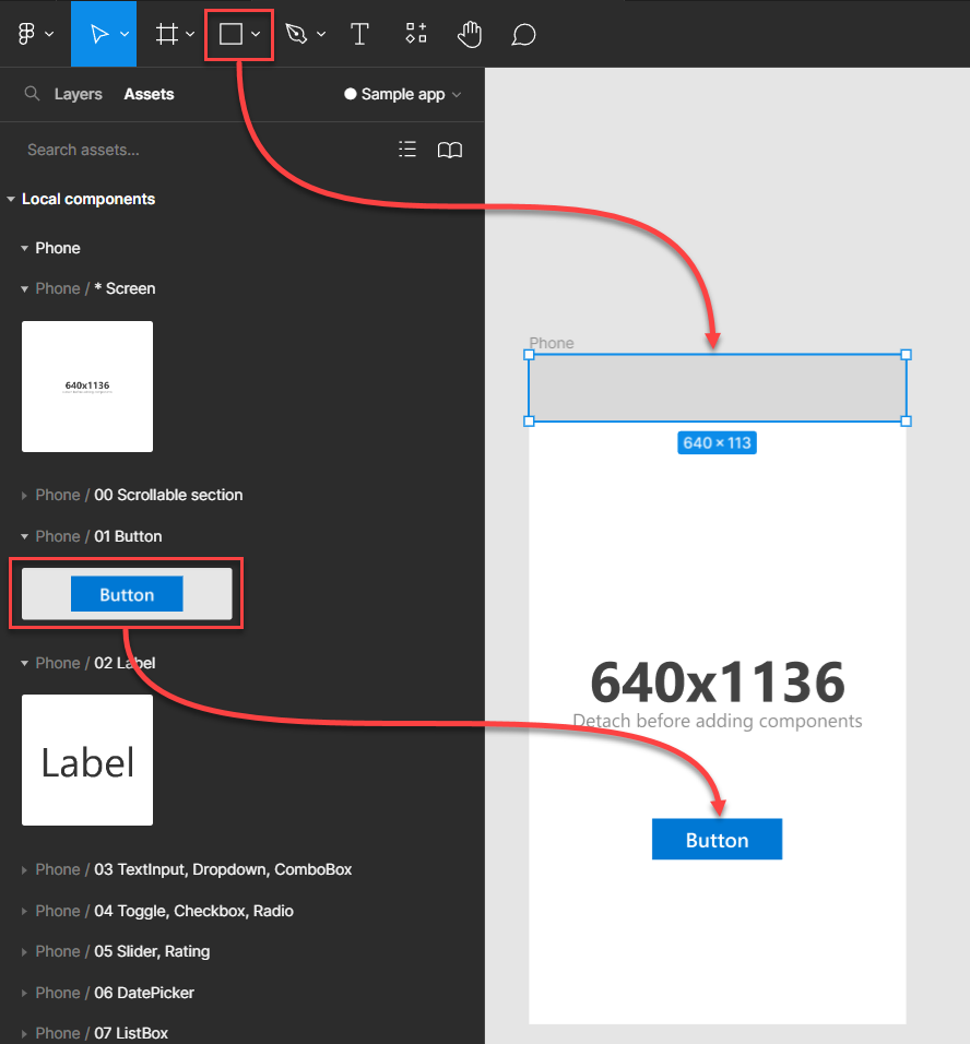
You can now start adding the Components as listed underneath the Phone category and also create your own style by using the simple shape tool to add some more flavor.
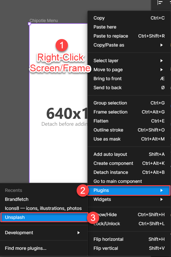
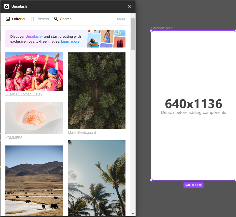
Adding background effects with Unsplash
To add background effects with the Unsplash plugin, right click your Screen/Frame and select Plugins > Unsplash
There are two main ways to pick and explore your royal free pictures, you can either see a pick from the “Editorial” tab or “Search” for one based on category picks or by searching freely. When you’re ready to pick your image, just select it by clicking on it.
After selecting your background image, make sure to resize and place it to fit the screen. You can also hold down the Shift-button while dragging to make it keep the image ratio – 1:1.
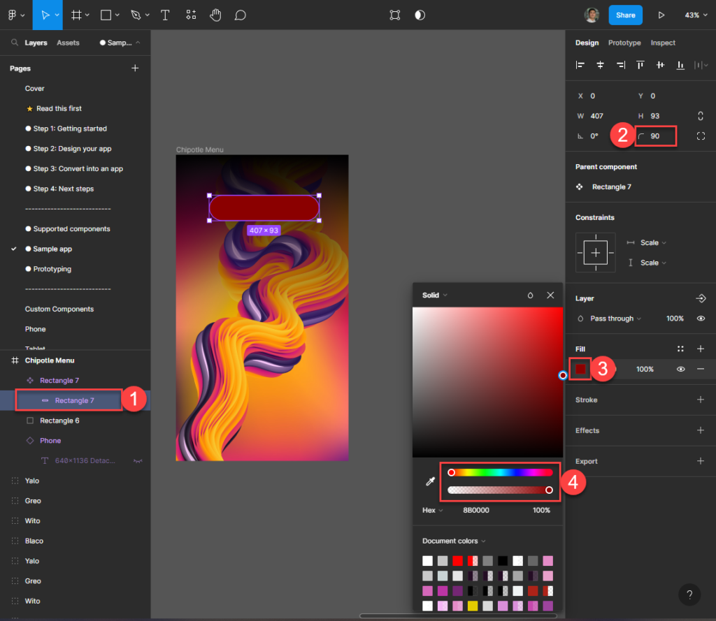
You can also add shading effects and overlays in Figma by adding shapes over the picture. Press the “R” key to rbing up the shape selector and drag a square shape on top of your background image
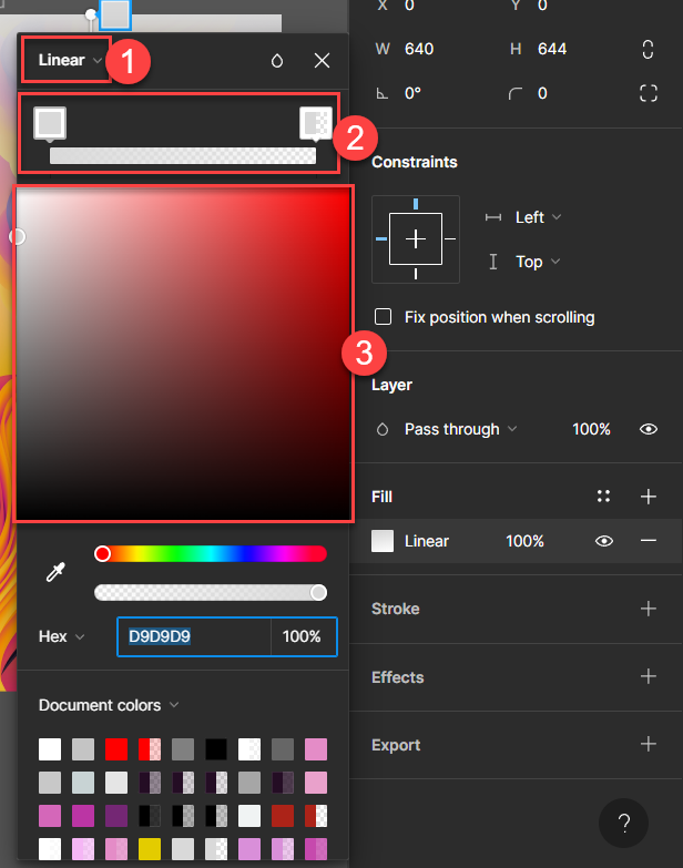
Adjust the color of your shading and play with the controls and colors to suit your liking. At the end you can also adjust the square object to cover either half or the whole screen/frame.
Adding custom button components
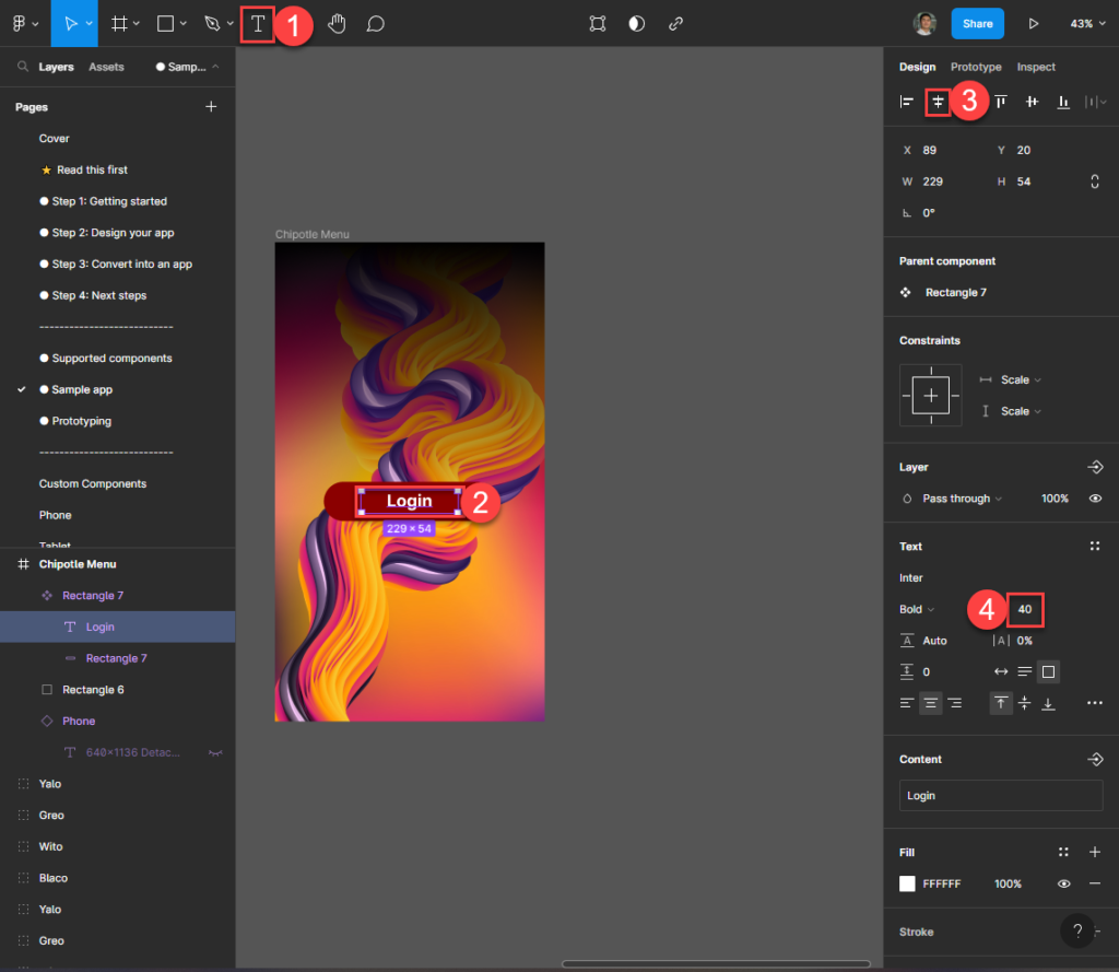
Nice! You’re now setup to create design and components with the powerful customization of Figma. And if you’re creative enough with the use of downloadable plug-ins and the toolbox menu to the right, you will eventually be able to create very creative UI ready to import to your new Power Apps.
Convert Figma page to Power Apps
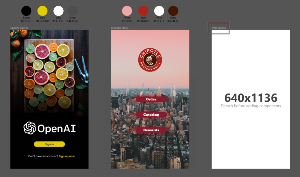
Before importing your Figma mockups to Power Apps, make sure that you rename the screens/frames that you do not want to include in Power Apps. In the above example, I do not want to include the empty screen/frame – so I rename it to “msft_Ignore“. The same keyword can be reused to all other screens/frames that you don’t want to include from any page in Figma.
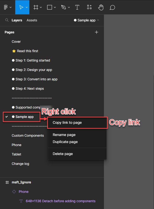
Now Right-click and click on “Copy link to page” – save the URL for import.
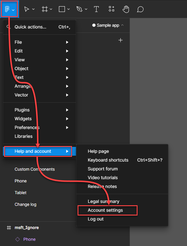
Navigate to your “Account settings“
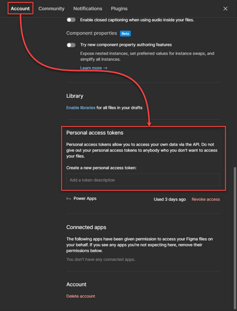
Create a new personal access token from the options menu above and copy the access token produced. Note! This will only be visible under creation, and hidden in the future – so make sure you copy this one before navigating any further.
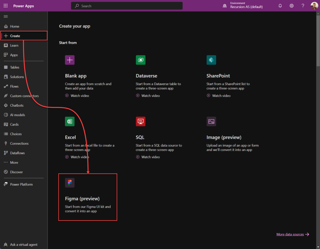
Go back to Power Apps and click “Create” > “Figma“
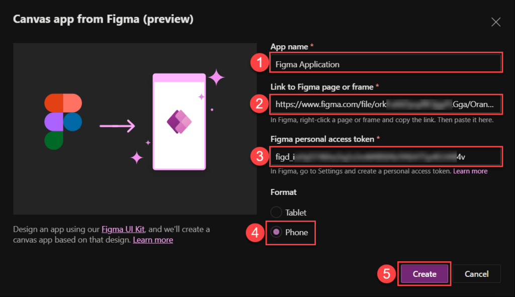
Now populate the information that we saved from previous steps. Give the app a name, paste in both the saved link from Figma and the personal access token, in my case I select Phone since I used the Phone screens, and click on “Create“.
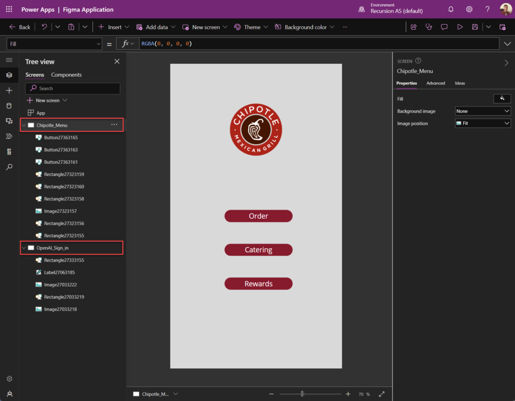
Note: You will most likely end up with some images and buttons not being imported correctly, leaving some objects greyed out. This is unfortunately normal. But we can fix this without any complications (see below).
Fixing missing imported objects in Power Apps
As seen on the Power Apps imported above, it’s certainly missing a few objects. Especially the background graphics and it’s customizations. I’ll show you how to fix the missing elements one by one.
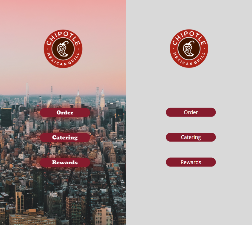
When specifying and comparing one of the screens, we can clearly see that we are missing the following components:
- Missing background picture with red sky (customized colors)
- Missing red fading color gradient behind the buttons
- Wrong button fonts being used
To fix these issues, we need to go back to Figma and import the elements one by one.
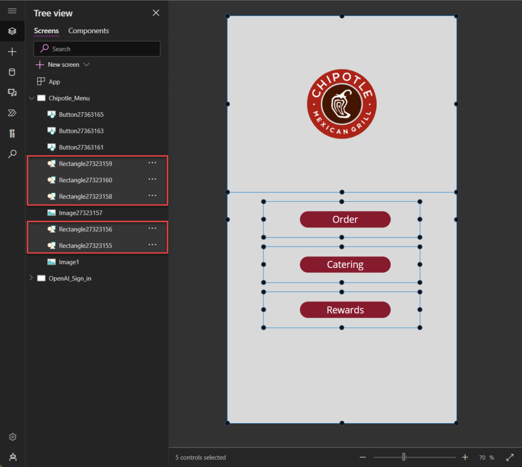
First, start by deleting the empty objects that is representing the missing objects.
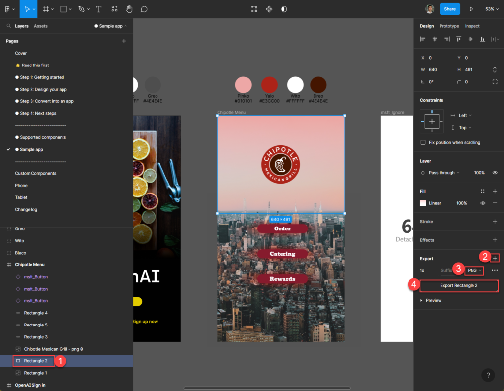
Background picture
So we’re starting off fixing the background picture with the red color tone.
First we’re making sure that we’re targeting the background image in Figma.
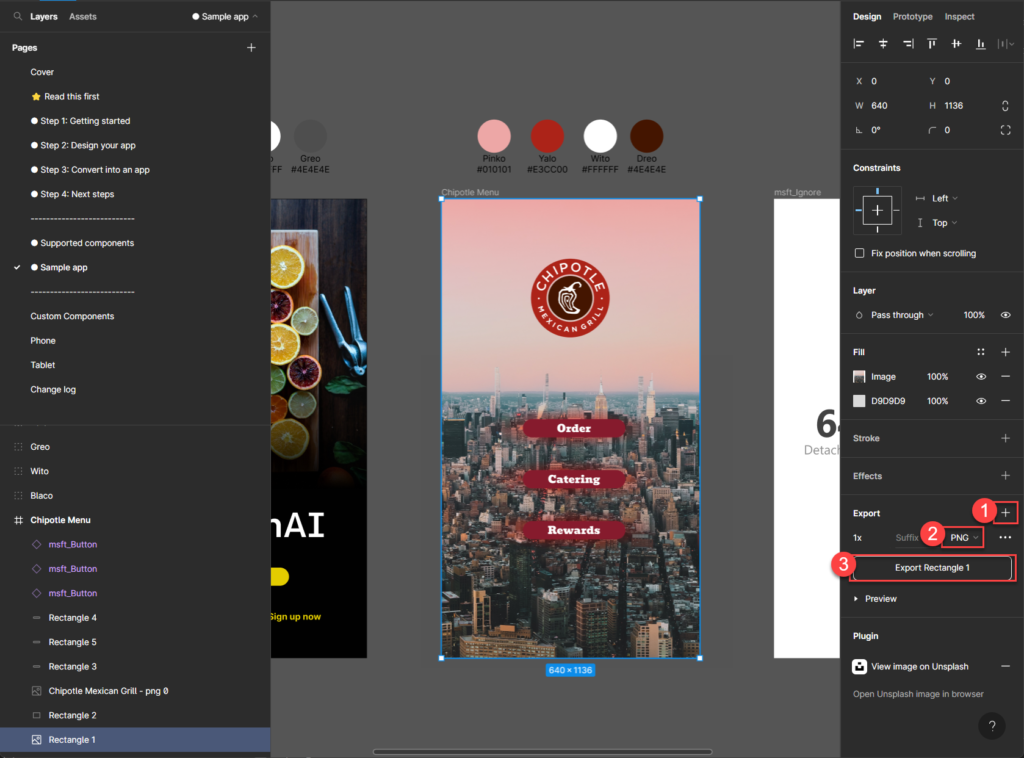
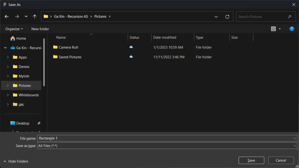
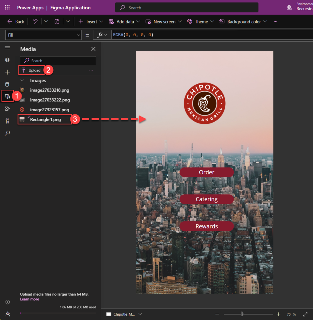
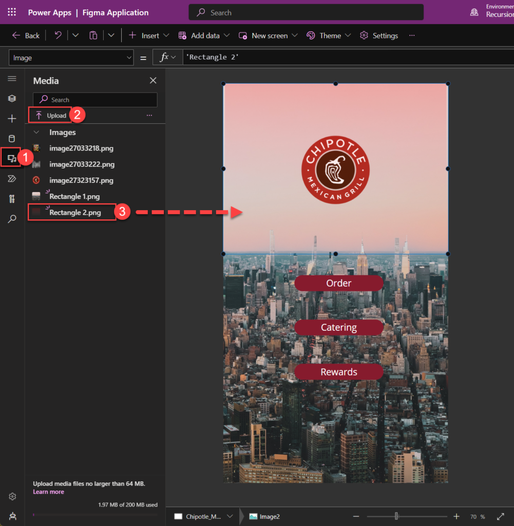
We’ll need to export the individual element as an image (PNG) and import it to Power Apps manually.
Drag and drop the picture into the screen and scale it to fit after dropping it.
Next lets do the same with the rest of the elements.
Background color gradient overlay
Button color gradient overlay
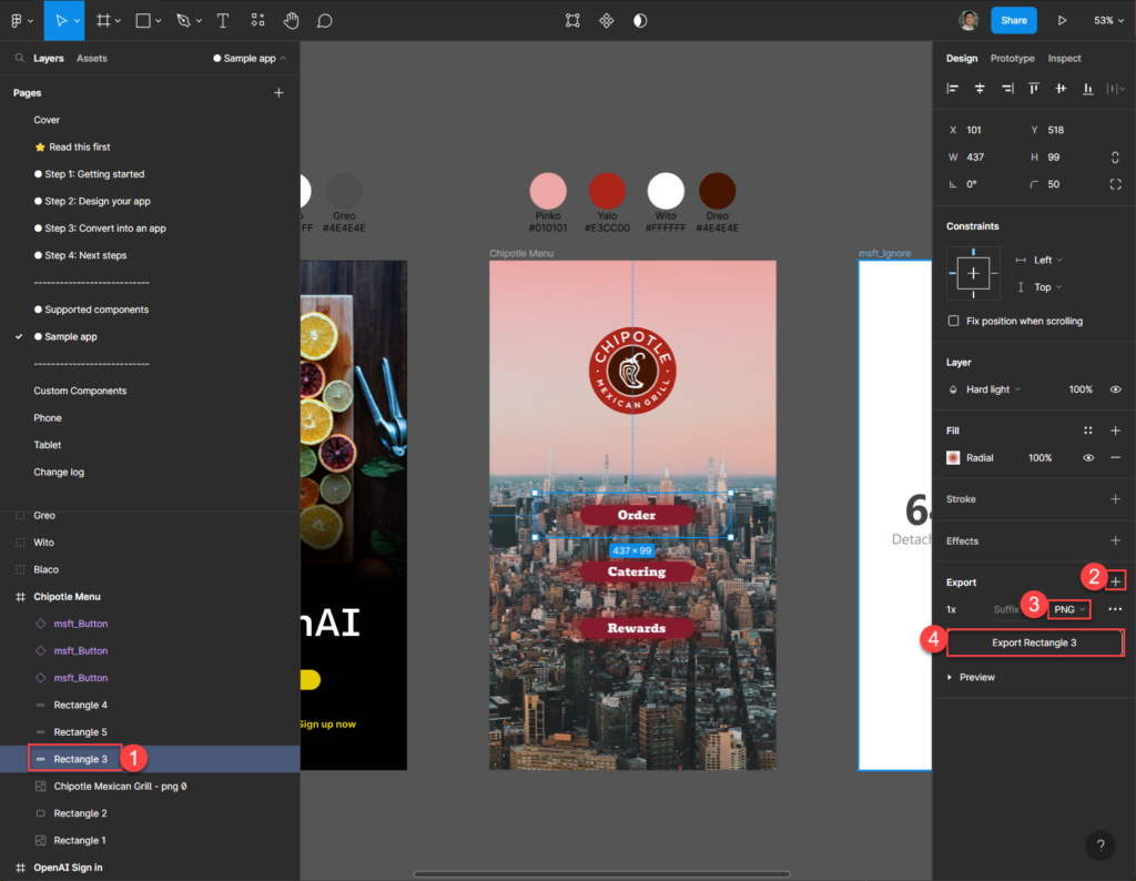
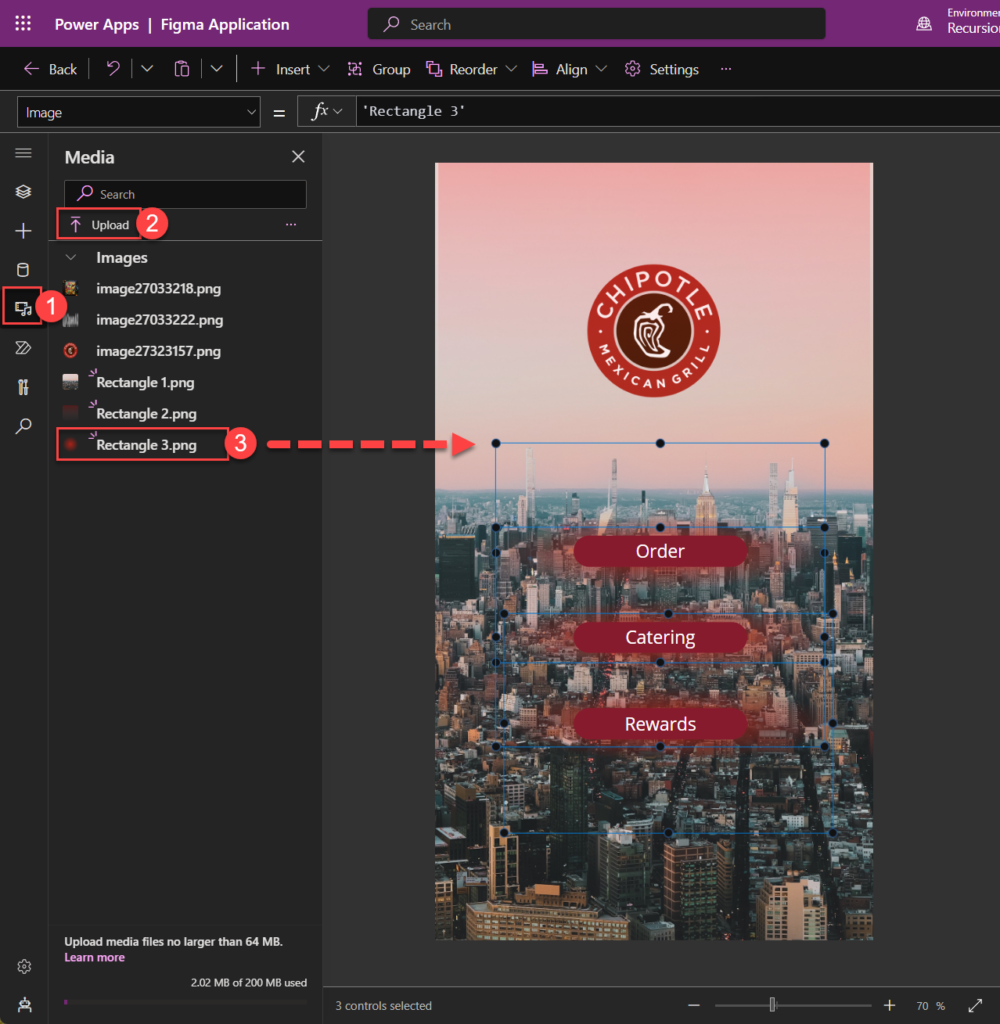
Drag and drop same picture for each button and bring the effect/picture to back and place them to center so that it’s aligned with the buttons.
Summary
I’ve now covered the process for setting up a Figma UI Kit for your projects, including using it for process definition documentation, wireframing, and portfolio building. Throughout the guide I also shared my experience with using Figma plug-ins to create modern UI designs and quick fixes dealing with Figma imported Power Apps that may have unrecognizable elements and objects in Power Apps.
Below is a listed summary of what we’ve gone through:
- Setting up and preparing Figma UI Kit from official template
- Demonstrated and designed frames using some of the of Plugins (Unsplash and Wireframe)
- Explained how to quickly mock-up a Low-Fi Prototyping based on Wireframe
- Designed a modern UI Canvas Apps based on Figma
- How to convert and import Figma frames to Power Apps
- How to fix most common missing objects in Power Apps
Leave a Reply